How to Model a Product Metrics Dashboard (Part 2)
How to setup reporting intervals, choose visualizations & thoughts on analytics tools
Hey BPL fam,
Welcome to part 2 of our series of modelling a Product Metrics dashboard.
Before we dive in, let’s recap what we talked about in our last edition:
What are the pre-requisite steps you have to take before selecting your metrics? (Vision → Company Strategy → Product Strategy → Goals)
How you first need to identify the right questions before selecting your metrics.
How to craft a metric tree to to lay down your dashboard’s blue print.
Note: I highly recommend reading the past edition to get more out of this one.
Let’s move onto the next set of topics:
Understanding the problems with “averages”.
Choosing a reporting interval for your metrics.
Picking fitting visualizations for various metric types.
Choosing an analytics & dashboarding tool for the right metrics.
Using “Radars” to organize your metrics into a hierarchy on your dashboard.
Note: I’ll continue to use the recruitment software example I did in my last edition i.e. an applicant tracking system that recruiters use to post jobs, track applications and send offer letters.
Understanding the problems with “Averages”
I’m sure that when you setup your metrics tree, you chose a few that were “averages” of some KPI.
I won’t say all averages are evil but as a PM, it’s critical to understand where they can be limiting. This is especially important for PMs working on early stage startups to understand where the data volume is still fairly small.
Some points to keep in mind:
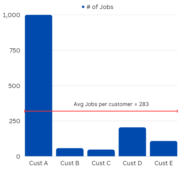
Averages Can Be Misleading: Averages are susceptible to being skewed by outliers or extreme values. For example, if a recruitment software has ten customers and nine of them have 10 job postings each but one customer has 1,000 job postings, the average would be around 100. This would be misleading. Now, if you were to devise a loyalty program that rewarded customers only when they posted > 100 jobs, it would fall flat.
Averages mix up segments: You would feel this even more if you’re operating in B2B SaaS where you might have SMB accounts alongside enterprise ones. Small businesses and large corporations might have very different needs and usage patterns, and averaging them out hides away their unique characteristics.
So, what are some tactics to keep in mind to offset the perils of averages?
Pair with other Statistics: Consider using median (the middle value) or mode (the most common value), which can be more representative of a typical value, especially in skewed distributions. This is exactly why Netflix used to use “Median view hours per month” their North Star Metric as (not average).
Image Credit: Lumen Learning
Visualize Distribution: Instead of only relying on averages, also look at the distribution of your data. Visualizations like histograms or box plots can provide more insight into the range and dispersion of values.
Segment Your Data: Consider segmenting your data based on relevant categories or characteristics. For example, separate your users into different groups (e.g., small businesses vs. large corporations) and calculate metrics for each group separately.
Now that we have that out of the way, let’s move to the next step.
Choosing a Reporting Interval
Alright, so we have a metrics tree in hand. The next step to figure out is the timeframe you should be measuring these metrics at.
In other words, should the metrics be measured at a daily, weekly, bi-weekly or monthly level?
Ex: for a grocery delivery app, you might want to measure the number of orders placed on a daily basis. However, for a real estate marketplace, it might be better to measure # of units sold on a bi-weekly or monthly basis.
Wait. Why is this even important? Because:
If you measure your metrics with a shorter than ideal timeframe, you’ll tend to be overly reactive and prone to premature decisions.
If you set it too broad, you’ll be too late in reacting to realities that needed more imminent attention.
Honestly, reporting intervals are fairly easy to get wrong. It’s ok to iterate and do some hit-and-trial, especially for novelty products with little precedent. But a few guidelines might help.
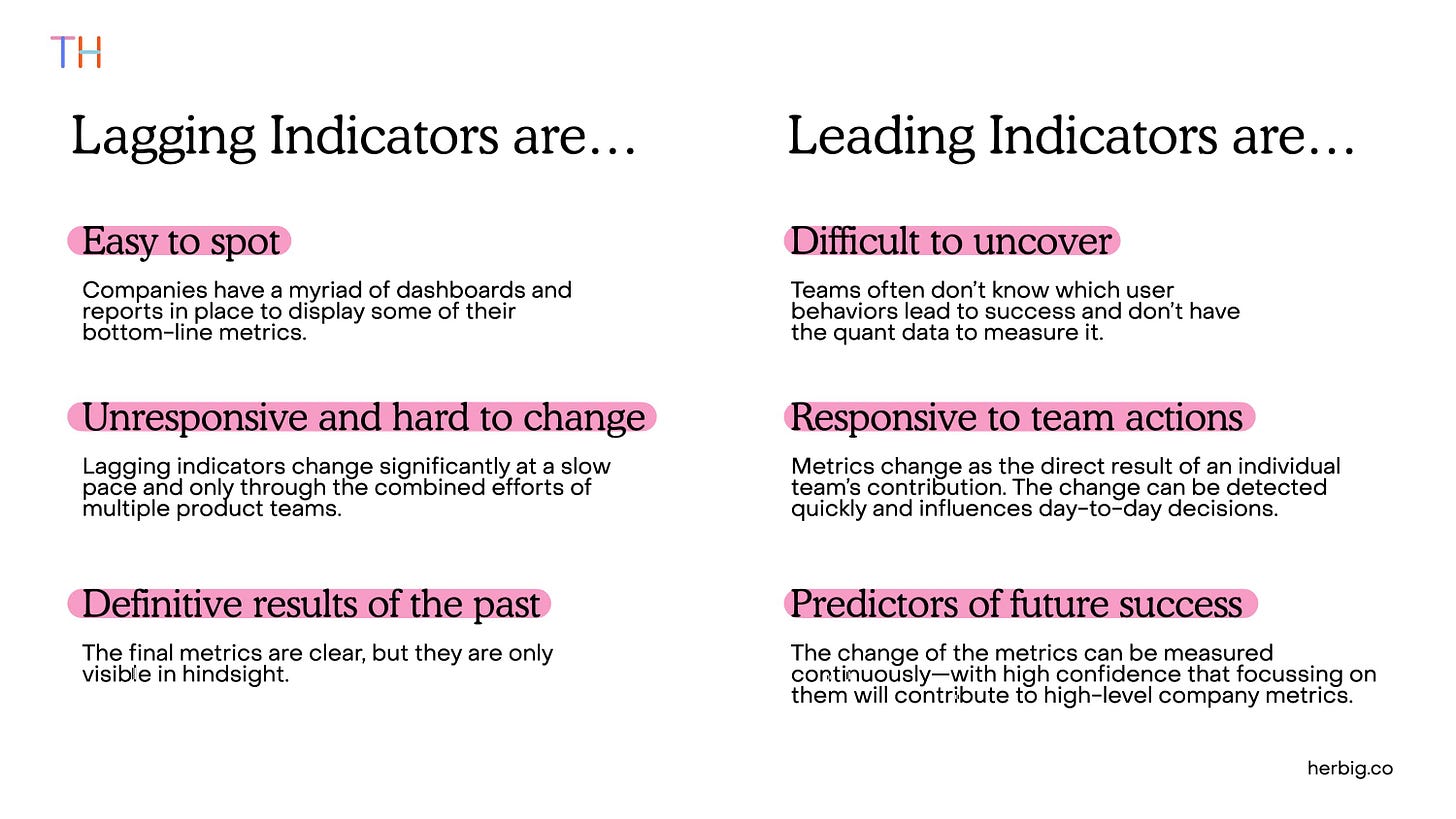
Before we go on, it’s important to understand the difference between lagging and leading indicators. If you are aware of these terms, please skip ahead:
Leading indicators are metrics that signal a future outcome. These are easier to affect in the short run. For example, a rise in the number of leads per used car ad for an auto marketplace is a leading indicator.
Lagging indicators are metrics that reflect an end result. They are harder to influence immediately. For example, churn rate is usually a lagging indicator for SaaS product.
Tim Herbig explains this best on his website:
Image Credit: Tim Herbig
There are multiple factors involved in choosing the best time interval for each metric.
Here’s a mental checklist:
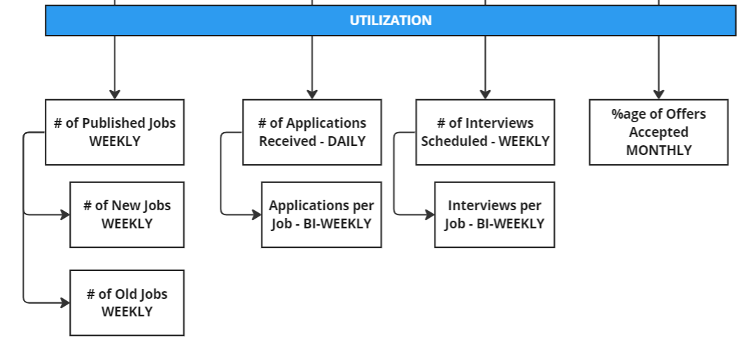
Type of Metric: More often than not, the frequency of a lagging indicator is broader compared to a leading indicator. For instance, in our recruitment software product example, total candidates placed or offers made is a lagging indicator that is usually tracked on a bi-weekly or monthly basis. On the other hand, daily active users or applications received is a leading indicator requires daily (or weekly) tracking.
Business Cycle: If you're operating in an industry with significant seasonal variation your reporting interval might align with these cycles. For example, online retail stores might see more online traffic over the weekends. Thus, they will choose a weekly reporting interval for items sold. Similarly, the sales cycle for B2B software might be longer and thus, a monthly cadence might be more suitable.
Metric Stability: Metrics that fluctuate greatly from day to day might be more meaningfully tracked over longer periods to smooth out the volatility and allow for trend spotting. For instance, weekly or bi-weekly job application counts (for a recruitment product) is more informative than daily numbers.
Data Availability: Some metrics might be limited by the availability of data. For example, a metric like "time to fill a job position" (a lagging indicator) can only be calculated after a position has been filled, dictating a longer reporting interval.
Customer Behavior: Metrics should also be responsive to customer behavior. For instance, if candidates typically respond to job postings within a week, it might be useful to track offer response rates on a weekly basis (a leading indicator that could influence future job postings and hiring strategies).
Use this checklist to ascertain what reporting interval to set for each metric. Add those into your metrics tree:
Picking Fitting Visualizations
Alright. We have our metrics list and their reporting intervals.
Next up - How do we visualize them?
By “visualization”, we want to see how we can graphically represent these metrics to consume them easily. In other words, should we plot the chosen metrics as a bar graph, pie chart, box plot, scatter diagram, time series etc.?
First, why does choosing the right visualization even matter?
Let me explain this with an example of the recruitment software.
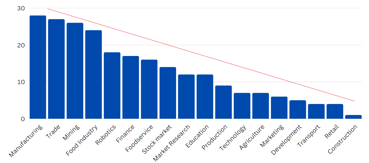
Assume you wanted to see the distribution of the posted jobs by industry.
Now, let’s say you choose to plot this data using a pie chart.
Note that the industry list can have over 50 distinct values. When you use a pie chart, it breaks it into a cacophony of slices. The human eye is pretty bad at comparing surface areas, especially when they are pretty close in size.
However, when you plot it as a vertical bar graph, our eye is great in evaluating which bar is taller/tallest.
Thus, choosing the right visualization matters.
Here are some tactical tips when going about choosing visualizations:
Use Pie Charts only when # of distinct values < 5: As explained above, pie charts work better when the number of unique values for the metric being measured is small. It’s ideal when you want to measure bi-modal metrics like ratio of hired and unemployed people or work arrangement preferences (remote, on-premise, hybrid).
Use gauges when tracking a metric against a goal.
Use line charts for longer-term time metrics: If you're measuring a metric over a longer term of time but small frequency (e.g. year-to-date weekly active sessions), use a line chart. A bar chart will contain an overwhelming amount of bars that will defeat the purpose.
Use a grouped bar chart instead of a stacked one when the need is to compare individual segments.
Use a stacked only when measuring the total of the segments clubbed together matters.
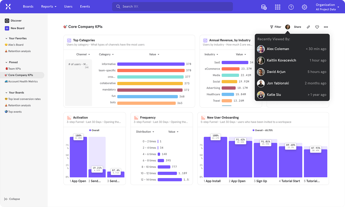
Don’t be afraid from using a simple table. Everything doesn’t need to be a pretty chart. Situations where you have depict multiple attributes (e.g. if you have to plot traffic, conversions, cart value by device type) are best shown in a compact table rather than a clunky graphic. Tables are also great to depict rankings or a leaderboard e.g. an industry-level breakdown of traffic with percentages.
Depicting distributions: Use histogram when you have to depict the distribution of values. It helps in showing how the values are skewed or if there are outliers. e.g. Showing how many companies have a specific number of job postings.
Visualizing Correlations: If you're exploring the relationship between two metrics, think about scatter plots. This kind of chart can help identify trends or correlations between variables. Example: Exploring if having more job postings leads to more interviews.
To learn more about visualization do’s and don’ts, I’d highly recommend reading up these articles:
How to choose data visualization by Chartio
6 Data visualization techniques by Geckoboard
Choosing an Analytics Tool
Alright, now we've got our dashboard elements ready. The next step? Instrumenting the metrics in your product and choosing a tool for dashboard display.
There's often heated discussion about the best analytics tools, and each has its merits. The one you pick largely depends on your specific queries, budget, and resources.
Most early-stage PMs are trying to answer fairly basic questions that most analytics tools can handle. For instance, tracking weekly rides booked on a ride-hailing app or transactions on an e-commerce site. Therefore, diving deep into feature lists to choose a tool is unnecessary unless you're addressing complex queries.
But I’ll share my personal thoughts about the products I’ve personally used (honestly, I haven’t used them all, so I can’t comment on options like Heap, Omniture and Adobe Analytics).
Again, your scenario might vary, so please exercise discretion:
Mixpanel
Mixpanel is renowned for its event tracking capabilities which means it’s great at tracking transactional actions like going from free to paid, booking a ride, putting something in a shopping cart or saving a playlist.
It also does amazingly well if you want to group user profiles and run a cohort analysis to see how a segment of users are engaging with your product. It’s pretty easy to setup, the pricing isn’t insane and the community is solid.
Amplitude:
Amplitude has got all the basic charts and templates but provides a lot more control on dashboarding and end-to-end user journey tracking (with a feature called Amplitude Experiment). It’s got cohort analysis too.
Where it goes one step above Mixpanel is predictive analytics, which can be very useful for forecasting user behavior and guiding product development decisions.
I’m also super impressed by it’s correlation features which allows you to test a hypothesis to see something like if number of applications positively impact number of offers sent. The price tag isn’t trivial and it does take a bit longer to setup with some involvement from engineering, so I would classify this for more mature, established product startups.
Yandex Metrica
Yandex Metrica is a free tool that provides web analytics and it’s ideal for top-of-funnel metrics like traffic, sessions, time on site etc.
I like it’s heatmap feature, which can provide insights into where users are clicking or spending time on a page much. It also provides session replay features (like Hotjar), allowing you to see user interactions on your site in real-time. I’ve heard Microsoft Clarity also has the same capabilities and is free, but I haven’t used it extensively.
Google Analytics 4 (GA4)
GA4 is the latest iteration of Google's popular web analytics service. It’s gotten a lot of hate on online forums but my personal suggestion would be to take some formal training before attempting to lock horns with it. It’s a one up over universal analytics as it’s got improved cross-device tracking and more comprehensive event tracking.
Like Yandex Metrics, GA4 tends to be strong for top-of-funnel metrics, helping you understand where your users are coming from and how they initially interact with your site or app. It has more flexible dashboarding options as well.
Now, if all your metrics can be tracked and reported on with one product, then you can use it’s native dashboarding facility to plot your charts.
Sometimes, however, metrics come from disparate sources. In this scenario, look towards something like Looker or Tableau to help consolidate and visualize this data.
In companies I’ve worked for, our accounting data used to come from Quickbooks or Netsuite and lead data would be tracked on Hubspot and top-of-funnel metrics were instrumented via GA3/GA4. I used Looker (Data Studio) to stitch all of this up.
Segmenting Metrics into Radars
Alright, so we've got our metrics and intervals sorted, and a tool to visualize them. But, we face a challenge: The more features we add to our product, the more the metrics we have to deal with, creating chaos on our dashboard.
To manage this I visually group my metrics into "Radars".
Radars are sets of metrics of varying importance, each reviewed at different frequencies.
I work with 4 types of Radars:
Core Radar Metrics: Typically, the north star customer & business metrics. Think activation rates, revenue, and user retention. I need these at the top as they represent the main goal.
Active Radar Metrics: These are metrics tied to your quarterly strategy or a specific feature you're working to enhance or optimize. You want these to be front and center as they tie closely to your quarter’s performance.
Ambient Radar Metrics: Your long tail of other metrics get relegated here. These are metrics related to non-priority features or initiatives. However, you can’t discard them. Instead, I try to color code them to track their progress on a monthly basis to indicate growth/decline. With tools like GA4, I use their alerts feature to notify me when the metric anomalously goes south or hits a high.
Decommissioned Radar Metrics: These are metrics for features you've retired or that no longer fit your strategy.
For a grocery delivery app, this could look like:
Core Radar: Number of orders, average order value, customer churn rate.
Active Radar: Median delivery time, restaurant retention.
Ambient Radar: Promo feature you launched 2 quarters ago, regional installs you were optimize for last year.
Decommissioned Radar: Metrics for discontinued features or partnerships.
Final Notes
Healthy dashboarding is the first step to be able to assess your product’s health as a PM.
But remember to not only see what’s happening but also be curious why it’s happening. The “why” doesn’t necessarily live on the dashboard though - you might have to go beyond it and gathering qualitative data through methods like user interviews and surveys. And remember, always validate your hypotheses with further testing before implementing major changes.
Let me know what you’re feedback was for this 2-part series. Hope it helped.
Till next time, happy dashboarding.








Nice write up Aatif. Useful, thank you. One minor disagreement on data viz: just avoid pie charts all together. They don't help make data easier to understand and they're plain bad for comparing data. Just use a good old bar chart.
A very good starter! Useful for checking your existing metrics setup or for creating a new one from scratch.